More Eye Candy

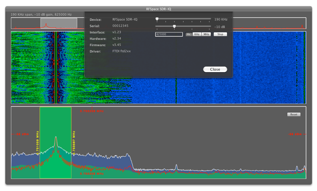
Check it. The overview graph now has a highlighted section that indicates which portion of the 190 KHz is being viewed in the bottom two graphs, and you can drag the highlighted area around as one would expect.
And I ditched the extra device control window and built it into the graph window as a sheet. It's much better this way.
A bit of good news: my previous concerns about frequency calibration turned out to be calculation errors on my part, so, if you set a center frequency of 750 KHz, you'll find WSB sitting dead center. Again, that's good. But if you wander out to the edges of the graph, the frequency labels start drifting. Hopefully it's a rounding error.
Also, you can right-click in the green-hilighted area to trigger the demodulator, but that remains unimplemented. I'll figure it out eventually. Until then, at least the UI is coming along nicely.